Project 2 Form and Composition
Sketching Thumbnails & Digital Iterations to Refined Compositions
Hello! It is important for designers to clearly communicate compositions. Through the exploration of space and placement, individual pieces of a design come together into meaningful images.
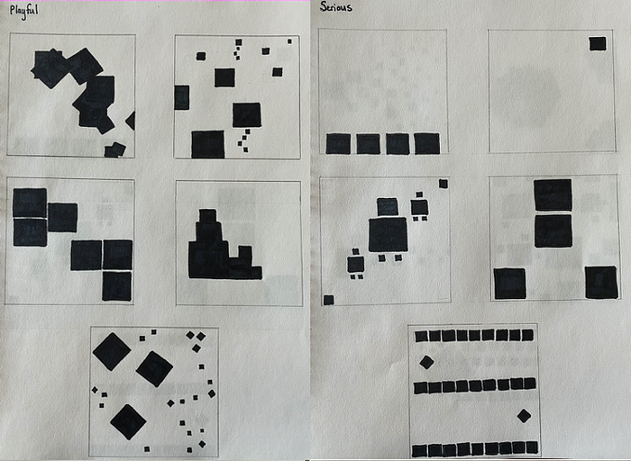
I created several compositions using solely black squares to represent the words playful, serious, noisy, quiet, dangerous, and safe. To communicate the words clearly through my designs, I brainstormed synonyms for each of the 6 words. Some of these synonyms included lively, earnest, turbulent, mute, threatening, and shielded. To side away from creating literal compositions, I thought about each word in terms of movements instead of objects. For example, I found spiral suction to be threatening and dangerous, while stiffness to be safe and sturdy. Below I created 5 initial sketched compositions for each word.

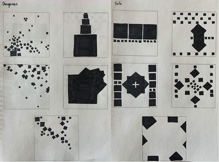
To build off of my initial designs, I chose to further explore the word pairings dangerous + safe and noisy + quiet. I used synonyms such as piercing, rowdy, and turbulent to represent noisy and still, lowered, and discreet to represent quiet. I used the words shielding, encompassing, and simple to represent safe and suction, explosive, and threatening to represent dangerous. I added more depth to my existing designs by playing around with the idea of space, repetition, and angles. Below are more refined sketches I created for the words dangerous + safe and noisy + quiet.

Digitalizing Compositions using Illustrator
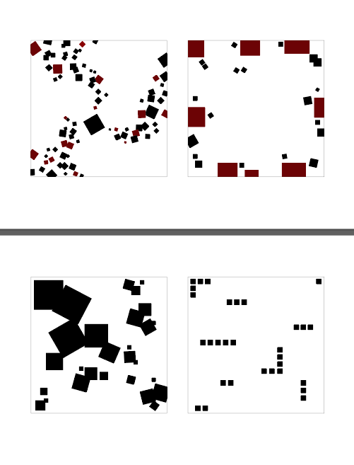
I continued to further explore my compositions with the words dangerous + safe and noisy + quiet. I decided to focus on exemplifying the feeling of suction and turbulent flow in my dangerous composition and I worked on an encompassing feel for my safe composition. For my noisy composition, I worked with the idea of disunity and disorder by using overlapping and angled squares. In my quiet composition, I scaled my squares down and oriented them only in the horizontal and vertical directions to add simplicity to the design.
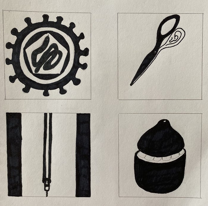
I translated my work into illustrator and played around with creating a reversible figure/ground composition. I created some initial sketches for my figure/ground designs and translated one of the designs into Illustrator. I did not use squares in my figure/ground compositions, but I will explore this later on. For my current figure/ground sketches, I worked on creating two hidden images per composition.
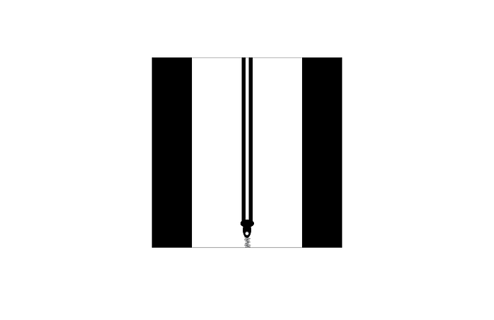
Further Digitalization and New Figure/Ground Compositions Using Just Squares
I continued to edit my square compositions in Illustrator and I generated more figure/ground compositions. I created 6 different sketches of figure/ground and then translated the sketched concepts into a more refined composition in Illustrator. I created my figure/ground compositions only using squares.
I edited my dangerous composition by removing the center square to add depth and uncertainty to the spiral paths. For my safe composition, I created a more encompassing feel by imitating a circular shape. I added more angled squares to provide the noisy composition greater disorder.
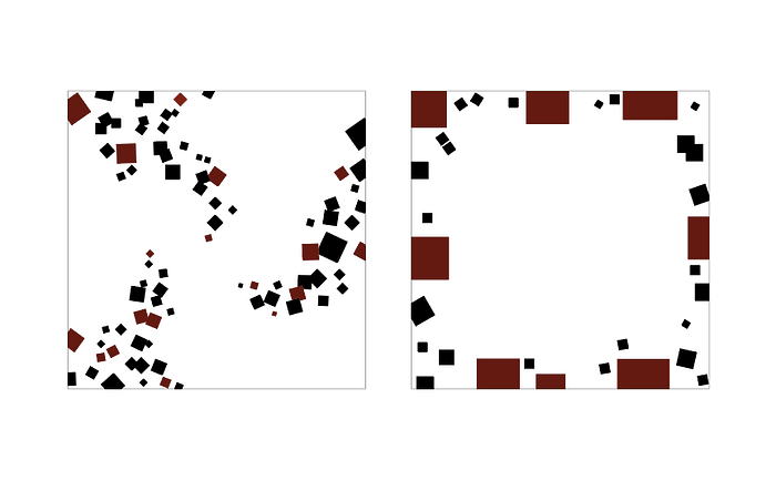
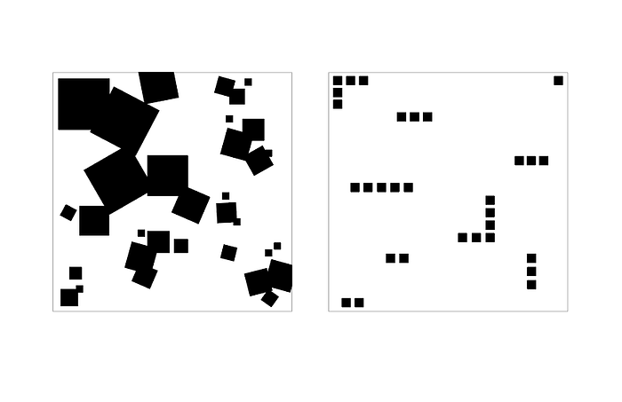
I played around with creating adjacent squares with white space in between for my figure/ground compositions. I also discontinued repeated patterns with white space and played around with scale to balance the white and black colors in the compositions.


Feedback and Final Compositions
I received one-on-one feedback on the compositions I created in Illustrator. Below I included screenshots of my feedback and I wrote out the suggestions I received to improve my compositions. I also included my final revised compositions.
For my dangerous composition, I received feedback on potentially adding back the black square in the middle because the spirals alone made the composition appear playful. The black square would serve as a pit/hole or the source of suction. In my final composition, I lessened the intensity of the swirls and added in the center square with additional black squares tracing a path into the hole (center square). For my safe composition, I received a comment on the use of overlap in the top right corner of my composition. I eliminated the overlapping squares to add unity to the design and I extended the right most squares a little further to the center to add greater symmetry to the design.


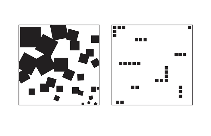
For my noisy composition, I had comments on more gradually decreasing the size of the squares from the top left corner of my composition to the bottom right corner of my composition. For my final submission, I increased the size of the top left square. I eliminate the smaller squares scattered across the composition and relocated them to the bottom right corner. I added in more squares to eliminate some of the empty space and adjusted the angles to add greater disorder to the composition. I kept my quiet composition the same for my final submission.
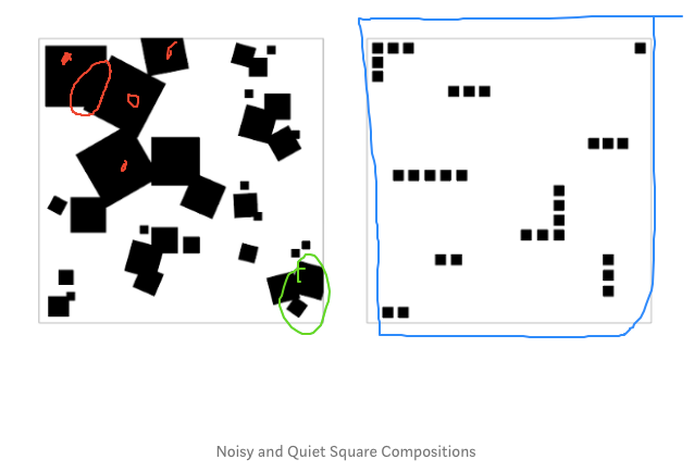
My figure/ground composition did not quite meet the criteria/goal. I received feedback on eliminating the rightmost squares that are bleeding off the page and shifting the rest of the composition to the right to add symmetry and balance to the overall design. I also received feedback on eliminating the center, resized square because it was distracting to the viewer. I received a suggestion to increase the size of the squares so they would better fit the given space for the composition and extend the square, diagonal pattern to the top left corner. I tried to work with this composition, but it was difficult to resize the shapes and to obtain the 50/50 black to white ratio I desired.

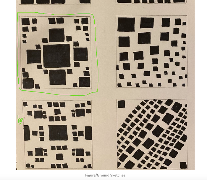
During my feedback session, I also discussed my figure/ground sketches. I received feedback on potentially expanding on my second row of compositions. I went through with this suggestion for my final figure/ground composition. I played around with scale and empty space in my design. I gradually decreased the square size from the top left corner to the bottom right corner, while increasing the space between the squares to balance the white and black colors in the composition. I translated the composition into Illustrator as pictured at the bottom of the post.


I hope you enjoyed reading about my design process! I had a great time working on my compositions. I learned a lot about the importance of space and placement of individual objects to create clear and appropriate compositions. Through exploring design principles such as balance, contrast, and unity, I was able to learn how to better communicate ideas and more carefully display meaning in my designs.
